It probably won’t, but the web might do the trick.

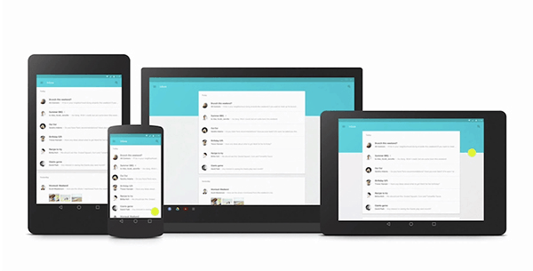
At Google I/O, Google announced their new material design look and feel for Android L, Chrome and virtually everything Google.
If you want to learn more about the concepts of material design, then you best watch the part in the I/O keynote about it:
The question this raises for me is how this will affect iOS and Apple.
Material design for Google isn’t limited for Android – it is all encompassing. Up until today, when you designed and built a service, you had to design it 3 times:
- For the browser
- For iOS
- For Android
A lot of the players, being mobile first, started with iOS and then moved on from there. This tended to give the iOS design principles a head start. In the past, this meant apps that don’t adhere to the Android design principles. Today, it means that people are conscious enough for the need to design twice.
But then what do you do with the desktop part? How do you maintain a look and feel that fits your brand, iOS, Android and the desktop?
Before we try and answer this question, let’s first see what makes material design so enticing for everyone – and I am not talking about UI here:
- It is suitable for all screen sizes and input methods:
smartwatch,smartphone,smart-tablet,smart-auto,smart-TV andsmart-PC - It has a well documented and well thought out guidelines for the design, making it easy for designers to learn and follow
- It comes with code that enables using it everywhere (Polymer)
So we have a design language that has been formalized, suitable for all screen sizes and display options conceivable today AND with ready tools for developers. Can you ask for more?
Material design changes the context, as it gives the designer and the frontend developer a good starting point that is suitable for desktop and Android; and can be tweaked to look nice on iOS with some modifications. You can find an example on medium done by a designer as an experiment.
What will be interesting to see here is how will that affect cross platform development tools and the way people design HTML5-based apps that run everywhere. There are two tracks here, both can be painful to Apple:
- Web apps and websites designed for mobile will adopt material design, so when you use Safari to browse the web with your iPhone or iPad you’ll end up interacting material design sites
- Cross platform apps will go for material design in their mobile first development, bringing more of Android and Google into the iOS world
How this unfolds? Who knows?
Maybe tomorrow we will see some tweaks made by Apple to its design to make material design less practical on iOS. Most probably it will get ignored for now, but I am sure Apple is following this trend.
The real question is does Google has a chance in making a design language bigger than Android?
